


MVP style decisions instead of moonshots became the new normal.
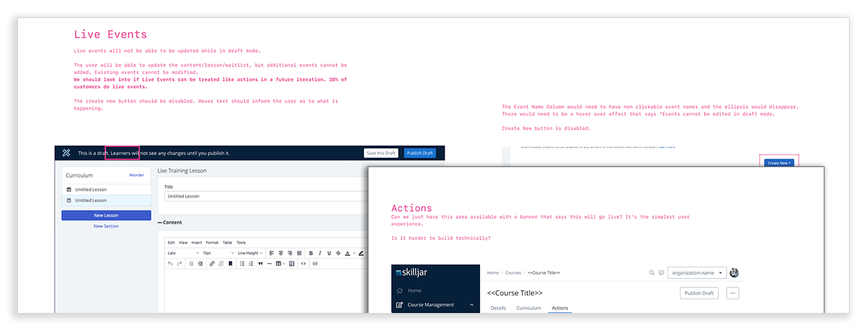
Drafts removed the need for live editing under pressure or after hours.

As we moved toward smaller, faster releases, we needed a different kind of brief. The purpose was no longer to define an entire solution, but to help the team decide whether a problem was worth solving and whether it deserved our attention now.

Why should we do it now?
How much is it worth?
How does it align to our company strategy?


update courses at 3:00 am!

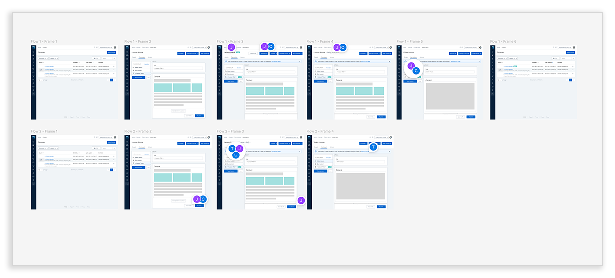
A sample of the first flows to facilitate discussion. Comments were left open to capture what was discussed in the meeting. They would be used as a heat map to determine the areas that we needed to focus on.
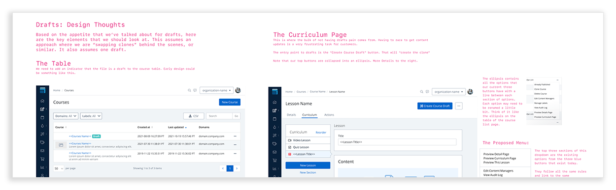
A sample of the notes that started emerging. These would get deeper as the sessions went on. Note that getting the UI right was not a priority here, getting ideas down was key.
Examples of areas that we would defer or just not do. These were decided based on how close to the core problem they were and how much engineering effort they would be. We wanted to launch fast.
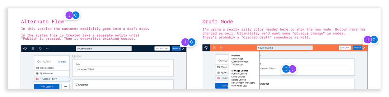
Early versions of the sticky header can be seen above, as well as part of a debate around if the customer should default into draft mode or have to click a button to enter it. Comments from other contributors on where we had opportunities were tracked. Notes were written in a conversational style to keep collaboration going.
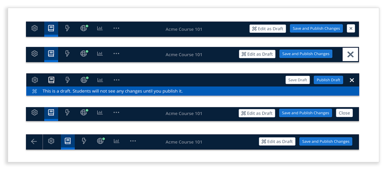
The sticky header, once approved for development, went through several variations and design critiques to balance button fatigue and clarity of navigation.
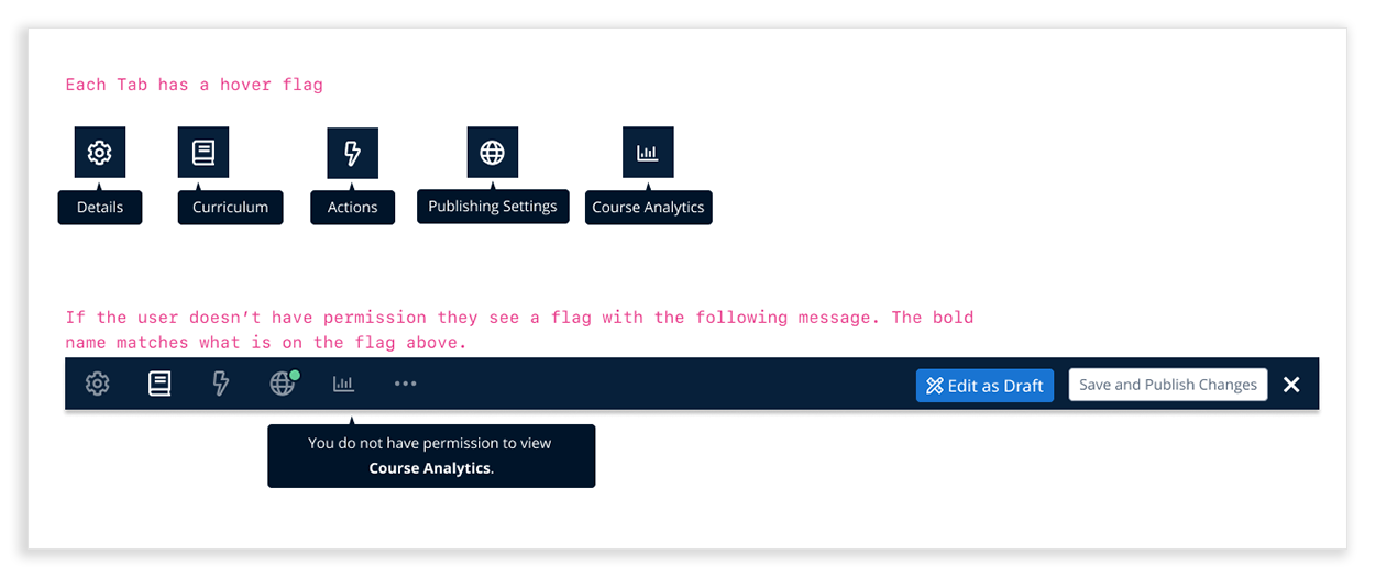
Details around the hover tips and RBAC controls, which allowed us to expose powerful actions without increasing cognitive load or violating admin permissions.