As part of the Skilljar Dashboard Home Page redesign AI Enrollment insights were added. For this feature, every element works together to support clear decision-making and build user trust.
The UI unfolds over time. The feature loads, analyzes, and gives recommendations based on data. It needed to feel deliberate, familiar, and trustworthy from the first click. AI features can easily feel ornamental or overbearing, so I set a clear design principle early: insights must support decision-making and action. They can never be theoretical. This was true for the answers and it guided every UI tradeoff across hierarchy, motion, emphasis, and loading states. It gave us a rubric for decisions.
I approached this by combining established patterns with targeted invention, applying rigor where it mattered most. Iteration was informed by design reviews, internal critique, and observation of emerging industry patterns.
This case study will look specifically at the design craft thinking that influenced this feature.


Business and Customer Impact
3 days → 30 seconds to insights
Analysis that previously required reviewing thousands of enrollment records and aggregating common sequences can now be surfaced instantly in a single interaction.
Analysis that previously required reviewing thousands of enrollment records and aggregating common sequences can now be surfaced instantly in a single interaction.
Established design principles for AI features
AI must always support human decision making.
AI must always support human decision making.
Created reusable AI UI patterns
Enhance the Gainsight Customer Hub Suite product UI library with updated and new patterns.
Enhance the Gainsight Customer Hub Suite product UI library with updated and new patterns.

Exploring the Design Space
Once we had landed on our core flow, I spent time diving into the various parts of the experience, looking at dozens of variations for each of the pieces. For example, on the button I explored multiple variations to find a design that felt present without distracting from the charts.
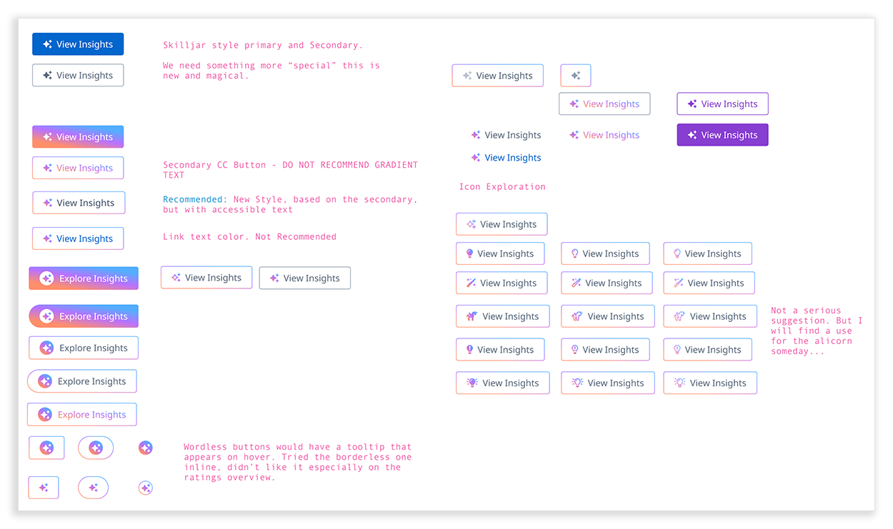
A sample of the buttons explored for the new AI button.
In context, charts were the primary focus and insights were secondary until the user clicked into them, so the button’s design emphasized restraint. To explore the space different "volume" levels of color were used. Some, like the image below, were too loud!
Ultimately, a secondary button with a gradient border and icon was selected. It was shaped by judgment, critique, and emerging UI norms in the industry.
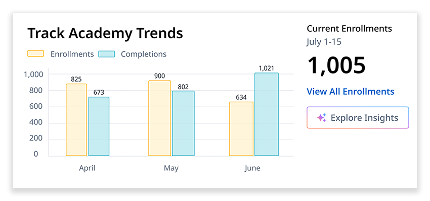
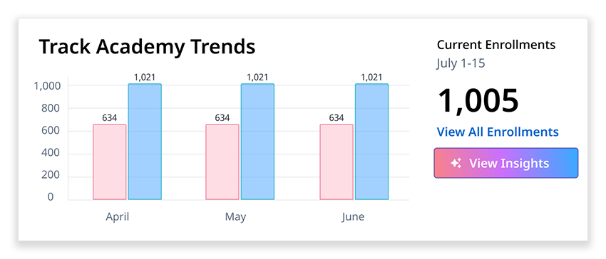
The finalized design of Academy Trends.
Building Trust While Loading
Early on, I led the team toward a progressive disclosure model in a flyout. We discussed solutions like chatbots or more freeform exploration, but ultimately abandoned them. Getting trustworthy and useful insights required specific prompts that could handle some of the realities of our existing data. We opted to write that prompt so our customers didn't have to worry about it. This also made testing significantly easier and allowed us to release quicker.
Sequencing the experience would be key, charts loaded first for familiarity. The AI-generated text could take between 5 and 14 seconds. This gave the user something to look at and evaluate. We knew from interviews with customers that they typically knew what courses were doing well, so the course at the top of each journey would not be a surprise. It would anchor the rest of the page.
Sequencing the experience would be key, charts loaded first for familiarity. The AI-generated text could take between 5 and 14 seconds. This gave the user something to look at and evaluate. We knew from interviews with customers that they typically knew what courses were doing well, so the course at the top of each journey would not be a surprise. It would anchor the rest of the page.
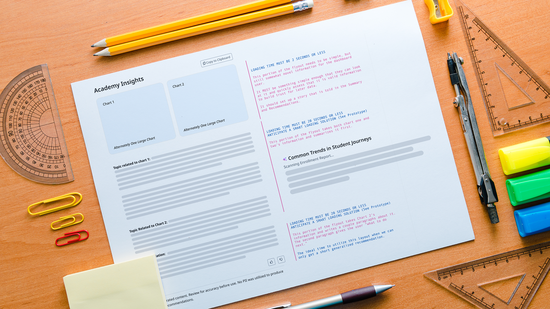
A low fidelity version of the flyout loading the content, generated via AI prototyping tools.
This allowed us to have conversations with engineering about any concerns.
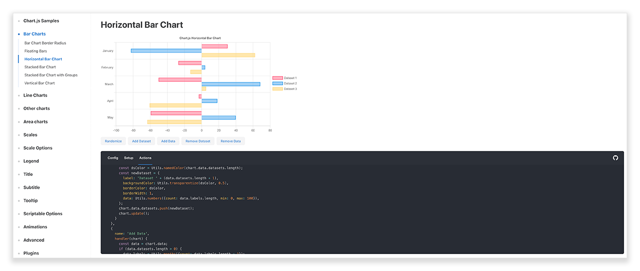
Chart.js was our chosen library for data visualization across the dashboard. It allowed us to move quickly with enough customization that experiences could feel like our brand.
The in-tool editing functionality allowed me to create pixel perfect specifications for our engineers, and know exactly what motion design would feel like.
The text below the chart required a thoughtful loading pattern since it would take time to load. We studied how chatbots and other AI tools handled this moment, from simple spinners to large illustrative empty states. We chose to build a loading state that built trust and set user expectations by having text give a preview of what the system was doing on behalf of the user.
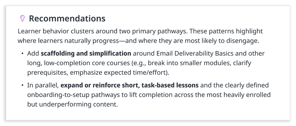
An example of the type of recommendations the prompt was able to generate, and the typography treatment it would receive.
This was the first time the Skilljar dashboard included prose, which introduced new design considerations. Spacing, line heights, and line lengths were carefully tuned for readability. The voice and content were carefully defined within the prompt, and key phrases were selectively bolded to make scanning easier.
Designing longer-form recommendations introduced a different challenge than charts or buttons. Signals about where the insight came from would be embedded throughout the text so that the user could manually verify if they wanted or needed to.
Putting the Pieces Together
The final flyout design centered on a question we knew would deliver immediate value: "What are the most common paths that a learner takes through the academy?" This seemingly simple question (which course do learners take first, what do they take next, and what comes after that) was deceptively complex to answer before this.
The way learners actually moved through content had made this analysis difficult in the past, and it had taken customers days to figure out, if they attempted it at all. Enterprise customers with significant BI investments could surface this insight, and we'd even set it up for some of them. They loved it. That's how we knew it was the right first question to tackle for everyone.
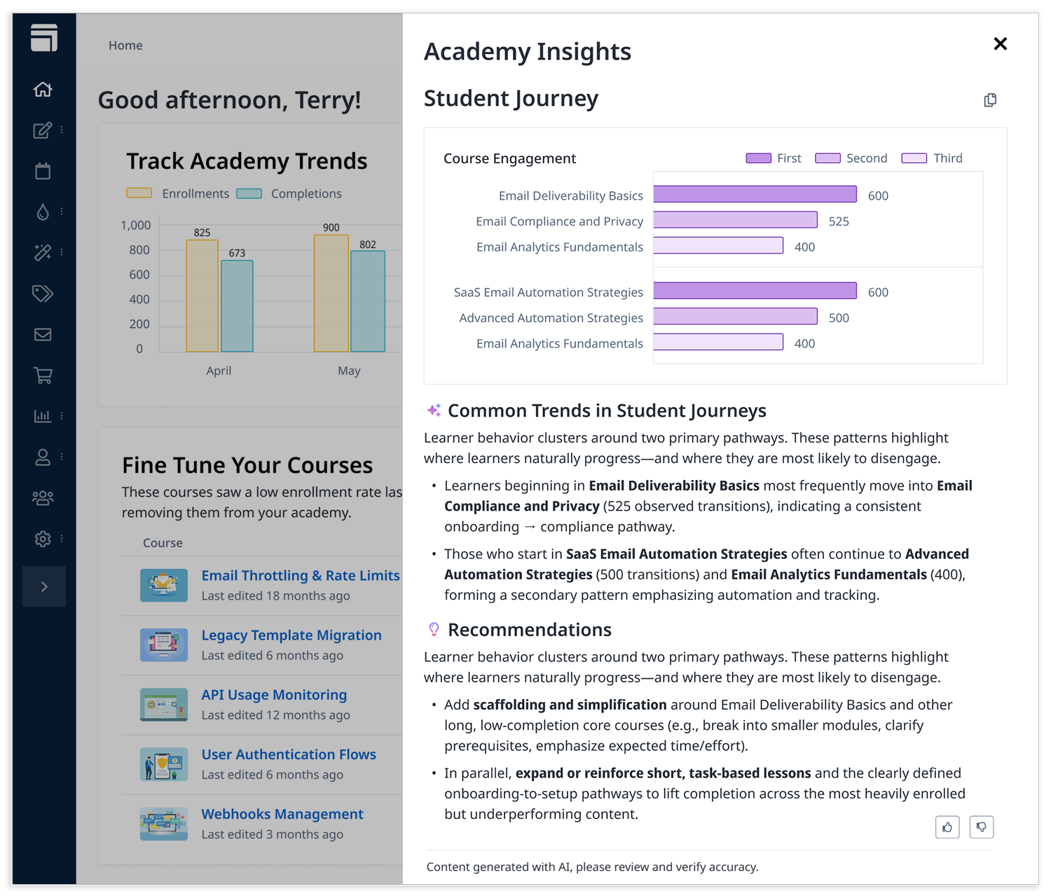
The flyout in its complete and open state. The insights that it gave customers around the student journey used to take days without expensive BI tooling, now in 30 seconds.
The complete flyout brought together every element we'd refined: the gradient-bordered AI button, the familiar Chart.js visualization loading instantly, and the thoughtfully sequenced AI-generated recommendations appearing after a brief, trust-building loading state. What once required days of manual analysis or expensive BI infrastructure was now available in seconds, directly within the dashboard.
Learning to Evolve
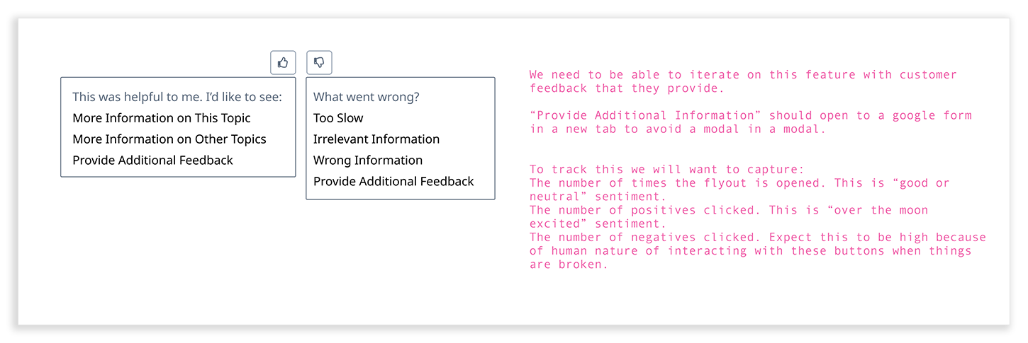
Feedback was embedded directly into the experience through a simple thumbs up / thumbs down dropdown. This created a continuous learning loop, showing which insights were useful, where deeper exploration was needed, and helping the team prioritize improvements.
Every detail, from motion to typography to gradient iconography, was intentional and iterative. Feedback from design reviews and team discussions informed refinements. Performance and aesthetics were integrated so that charts and text load in a natural, fluid flow.
Launch
The AI Insights feature launched in early March 2026 as part of a broader set of AI capabilities, including the AI Tutor and Course Ratings Summaries.
It brought a previously complex analysis, one that could take days, into a 30-second, in-product experience, while still giving customers enough context to verify and act on the results.
This work also established a foundation for how AI features should behave across the product. Patterns for trust, sequencing, and readability were designed to scale across the Skilljar dashboard and the broader Gainsight ecosystem.