
Eliminated a recurring manual enrollment export workflow previously required to monitor trends.
Reduced course editing from several navigational steps to one, compounding across frequent use. (9-12x per week)
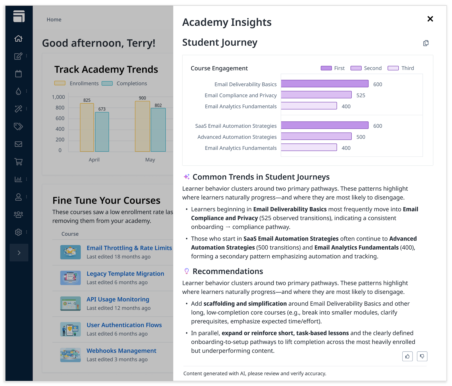
Analysis that previously required reviewing thousands of enrollment records and aggregating common sequences can now be surfaced instantly in a single interaction.

I synthesized that data and recommended the widgets we pursued first, crafted the final UI, and looked for moments to add delight to the dashboard as a whole.
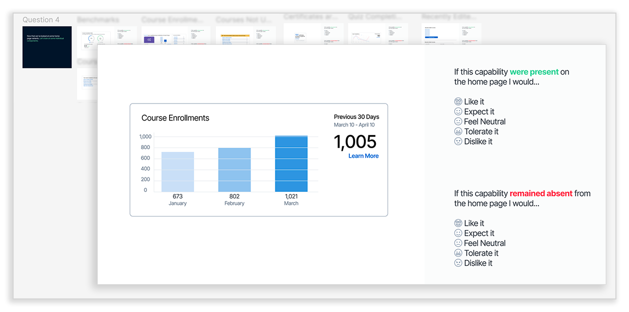
In the Kano model, a feature that the participant would "Like it" if it were present and "Dislike it" if it were missing moves to the top of the list to be worked on. Conversely, if they would "Like it" if it were there, and "Tolerate it" if it were not it is an indicator that the feature can wait.

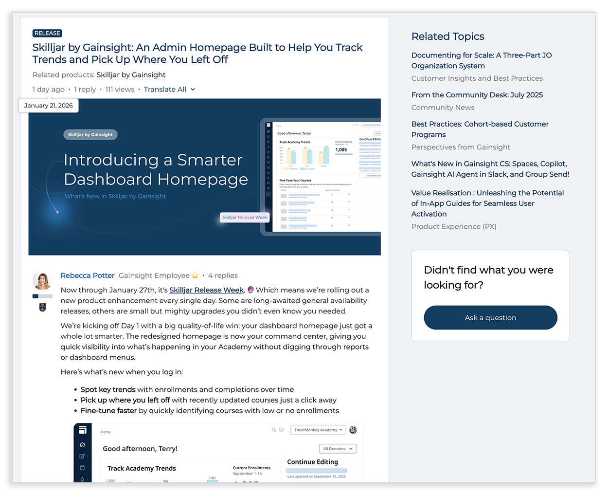
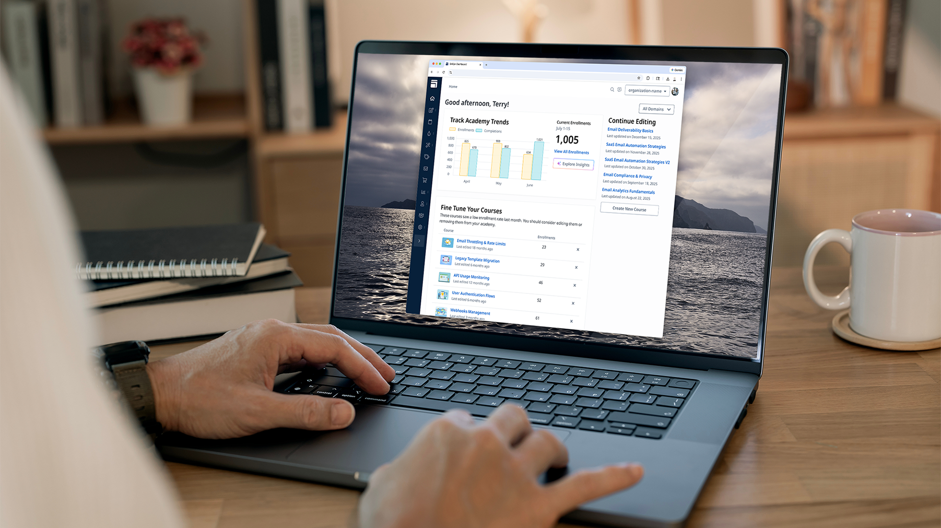
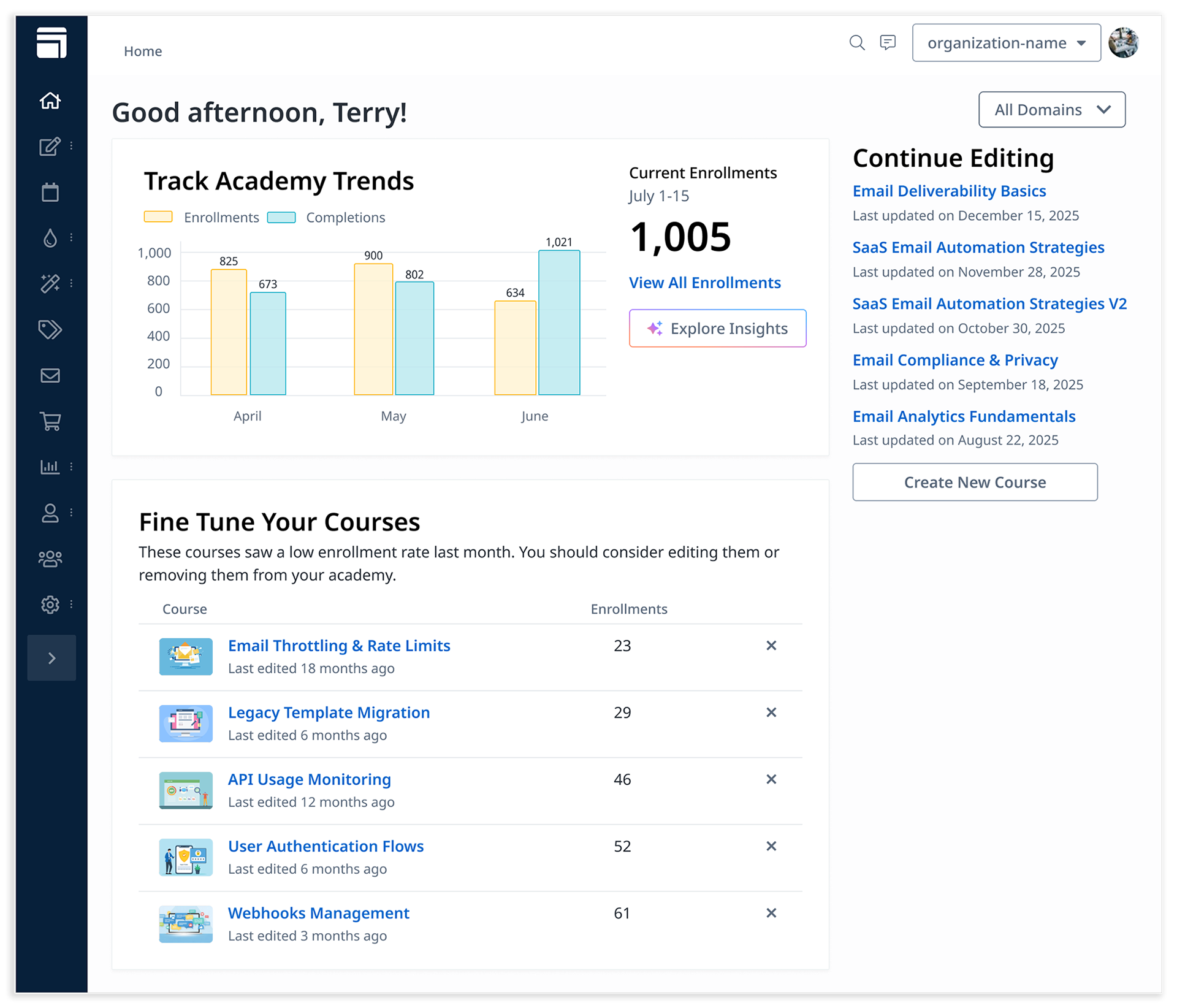
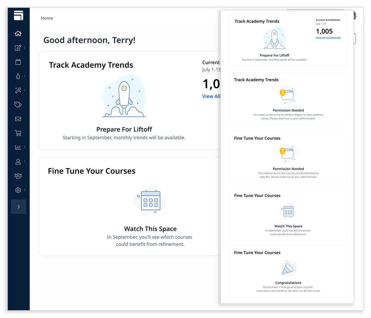
During the interviews several customers mentioned wanting a longer timeline on enrollments and completions. We ultimately limited enrollment trends to a three-month view. Displaying longer timelines would have required rebuilding backend infrastructure, delaying the launch. Instead, we linked users to the full enrollments report for extended data, delivering immediate value while leaving room for future enhancements. This kept the redesign lightweight, usable, and aligned with Phase 1 goals.
While some customers and internal stakeholders requested customizable widgets, the first iteration didn’t support enough roles or widget types to make it meaningful. We deferred customization until the core widgets were validated in real world use. This allowed us to launch and continue to evaluate needs, ensuring that future customization would be informed and impactful.
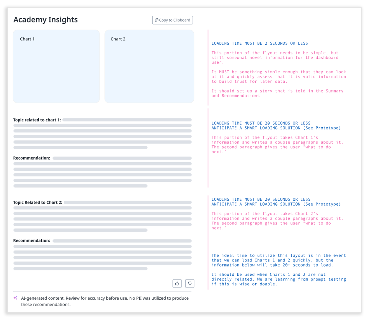
Tradeoff 3: AI Insights – “We NEED this, but rushing would be risky.”
Participants wanted actionable insights powered by AI, but launching alongside the redesign would have introduced legal, technical, and trust risks. While customers were eager for actionable AI insights, we decided to sequence this as a follow-up release, ensuring legal review, engineering validation, and design rigor before launch. This decision allowed us to launch on time, maintain reliability, and prepare a foundation for a thoughtful, trustworthy AI experience.
Early thinking on the AI insights feature, this flyout appears when the Explore Insights button is selected.
After some discussions about pros, cons and timelines I recommended sequencing AI as a dedicated follow-up release, ensuring it received the legal review, engineering validation, and design rigor it required. This was a difficult choice to make because there was clear signal for a need for this capability from customers.
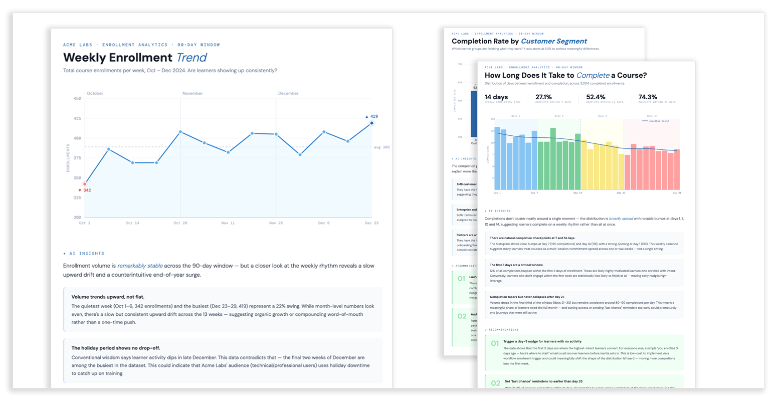
Early questions and queries using representative data and AI generated mockups.
These were used to rapidly test, validate, and refine prompts before diving into the UI design.
Throughout the process, I looked for ways to raise the bar on design craft. One example was creating new empty states and drawing custom icons to make each interaction feel purposeful and polished.