I led research and ideation on the redesign of Costco.com’s checkout experience. The project contributed to $1.3B in online sales growth over two fiscal years. By prioritizing high-impact changes, we delivered a checkout experience that strengthened the business and is largely still used today.
Before:
Costco.com had a checkout process designed exclusively for desktop users. Mobile users struggled to complete checkout or would abandon the process entirely. The flow included four steps that didn’t align with industry best practices. Users were asked to focus on choices they typically only made the first time they used the site—like adding a new address—or uncommon tasks such as shipping to multiple addresses.
After:
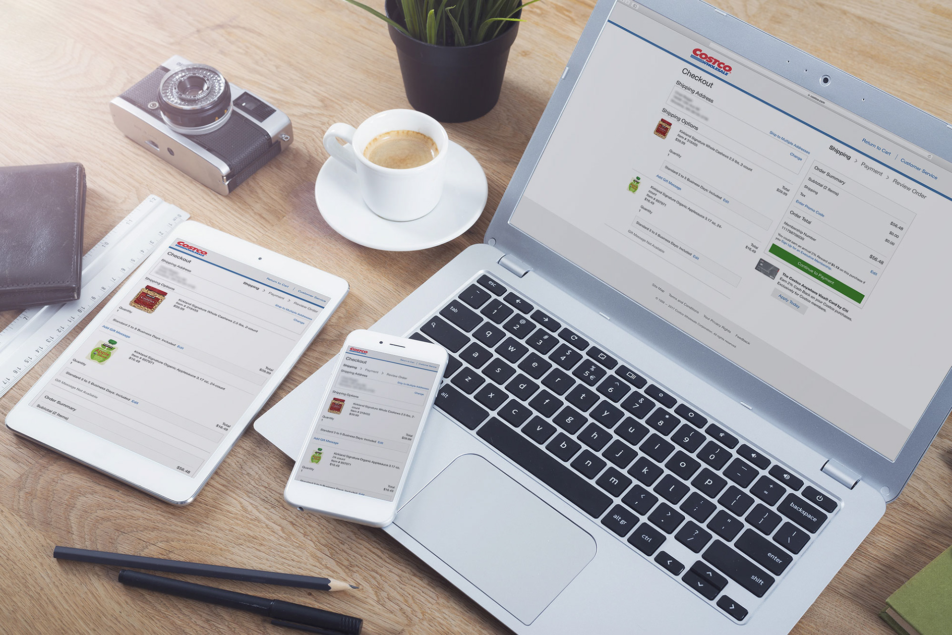
Costco.com's checkout experience was completely redesigned from the ground up. Steps were streamlined from four down to three, with a focus on the needs of the majority of users. The experience is fully responsive and mobile-first. It received excellent reviews from both users and executives, and it remains largely unchanged today, demonstrating its durability.
Over the next two fiscal years, Costco's online sales grew by $1.3 billion according to SEC filings. Improvements to the checkout experience noted externally as part of that growth.
My Roles:
UX Designer
UX Researcher
Part 1: Foundational Research
Early in the project, I was tasked with leading foundational research to guide the redesign. I compiled academic research, analyzed competitors, and drafted a high-level vision for a mobile-first checkout experience suited to Costco.com's scale.
I created detailed user flows that documented the existing four-step process and proposed a streamlined three-step version, including recommendations for modern interactions that consolidated necessary functionality.
My Deliverables:
User flows
Industry best practices comparisons
Overall experience recommendations
Part 2: Design and Study
The project was split into two parallel tracks: one team designed mobile-first screens based on the foundational research, while I partnered with another UX practitioner to plan and execute usability studies to validate the design decisions.
I remained deeply involved in shaping the experience, prioritizing what mattered most to users and minimizing less critical features. We tested two checkout frameworks through a large in-person study with 30 users across mobile and desktop, which guided the final decision to implement a three-step, three-page process.
I supported the design efforts by leading ideation sessions with a team of 10 designers. This work would be divided up as we moved into prototyping to a subset of that team.
I supported the design efforts by leading ideation sessions with a team of 10 designers. This work would be divided up as we moved into prototyping to a subset of that team.
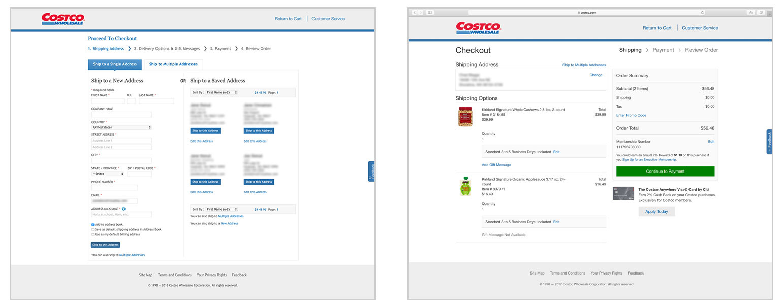
Page one of checkout before the redesign, and page one of checkout after the redesign. Note that the same options are still available to the user in the new experience (on the right) options used less often have been deprioratized or hidden behind progressive disclosure interactions.
There were questions around two different checkout frameworks to pursue. Both seemed likely to benefit our users, so we decided that testing both would give us the clarity we needed. My primary responsibilities in this portion of the project included:
- Crafting detailed scenarios that would allow us to test new or modified features in realistic workflows.
- Preparing an interactive prototype that accurately represented both frameworks for testing purposes.
- Managing the logistics of the study, including recruiting participants, scheduling sessions, and coordinating resources across teams.
- Facilitating usability studies in person, guiding participants, capturing qualitative feedback, and ensuring consistency in execution.
We ran a comprehensive study covering both mobile and desktop experiences with 30 users in person. The findings validated the major design decisions we had hypothesized, provided insights for fine-tuning interactions, and ultimately informed the choice to implement the three-step process that remains in use today.
My Deliverables:
Targeted scenarios for the usability study
Research plan for an A/B test with 30 in person users
Research report out presented by myself, my research partner and the global design lead to executive level stakeholders
Part 3: Design Round 2
Following the usability study, I took ownership of creating the Order Confirmation page. I delivered pixel-perfect mockups for all devices, maintaining a mobile-first strategy.
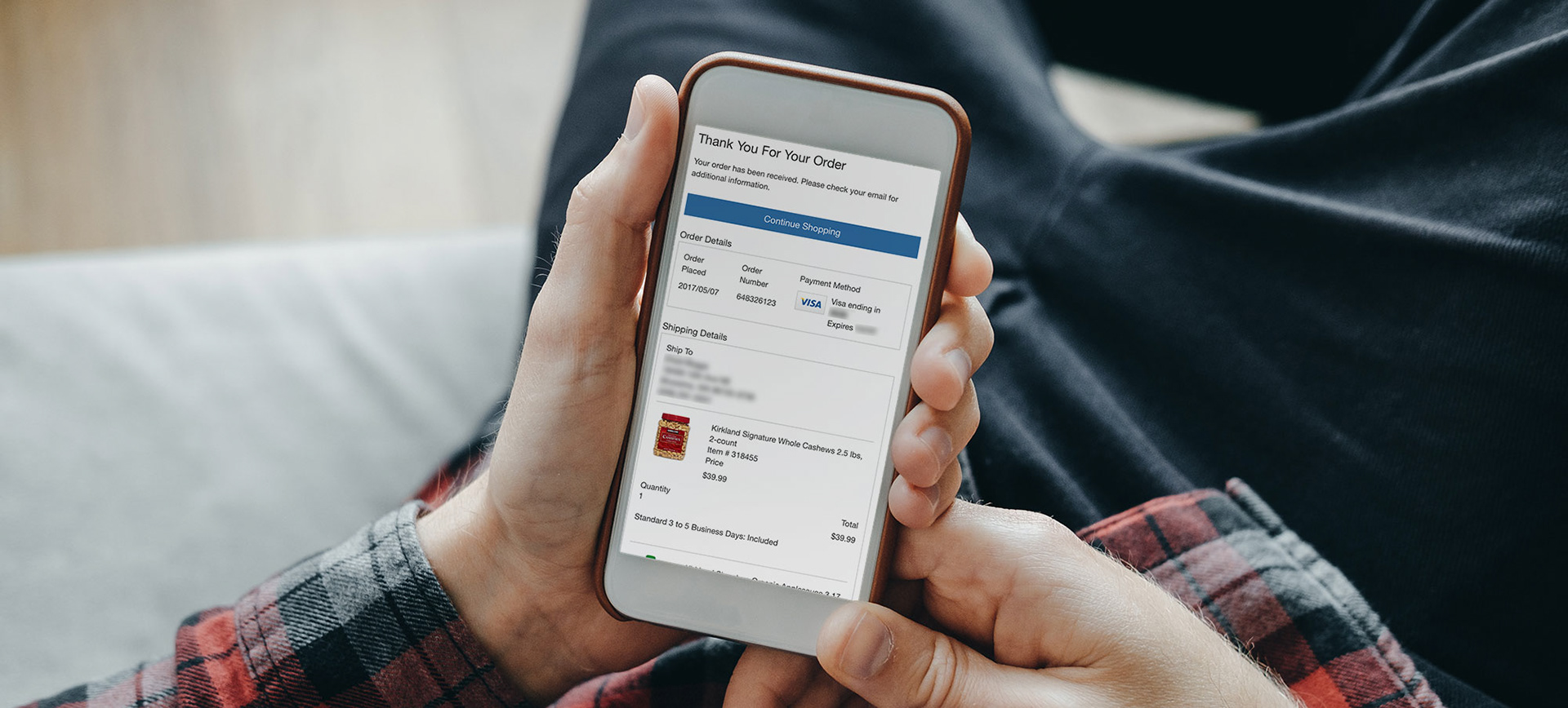
The order confirmation page in mobile.

The Order Confirmation page on desktop. "Cancel Order" functionality not shown.
My Deliverables:
Pixel perfect wireframes for the Order Confirmation Page in Desktop, Tablet Portrait, Tablet Landscape, Phone Portrait and Phone Landscape
Part 4: Reception
The redesigned checkout launched in 2017 and received immediate praise from executive stakeholders. Users provided positive feedback through multiple channels, highlighting the experience as streamlined, simple, and more intuitive.
According to SEC filings and industry reports, Costco’s online sales grew significantly over the following two fiscal years, reaching over $4.3B, up from $3B prior to the redesign. Many reports highlighted improvements to the checkout experience as a contributing factor to this growth. The checkout experience remains largely the same today, reflecting the durability of the design decisions.