I worked with the Microsoft Volume Licensing team over several years as a Designer II to help refine and modernize the experience commercial customers and partners had managing Microsoft software and services.
During this time, I worked across the portfolio with multiple user groups and led several design efforts. One of the largest initiatives involved reimagining Microsoft’s relationship with its commercial customers by improving clarity, trust, and long-term value across the purchasing and management lifecycle.
This, and other projects like it, would lead to my promotion as a Senior Product Designer.
This, and other projects like it, would lead to my promotion as a Senior Product Designer.
Before
Microsoft offered multiple channels for purchasing and managing software, products, and services, each built to solve a specific problem but rarely designed to work together as a cohesive system. For commercial customers, this resulted in fragmented experiences that were confusing, time-consuming, and difficult to navigate.
Customers often lacked a clear understanding of what software they owned, how licensing agreements applied, or where to manage users and entitlements. In many cases, organizations relied on manual spreadsheets to track purchases and access. Because ownership and value were obscured by complexity, customers struggled to fully realize the benefits of the products they were paying for.
After
Our team designed a more transparent, trustworthy experience that allowed commercial customers to manage users, purchases, and data in one cohesive place. By making ownership clear and actions intuitive, the experience began to transform how customers related to Microsoft.
Instead of navigating disconnected portals, customers could understand what they owned, who had access, and how to take action. This shift reframed the Windows Store for Business from a transactional system into a long-term management platform.
Role
Over the course of this engagement, I filled multiple roles as the project evolved.
During the Discovery phase, I led a team of agency designers and researchers to define the problem space, map the project plan, establish foundational research documentation, craft core scenarios, and design initial wireframes.
After securing executive alignment and approval from our Vice President, the team partnered closely with internal Microsoft counterparts. Together, we developed a multi-year UX roadmap, expanded on early concepts, established visual design rules, and defined a responsive strategy for the site. I worked directly with the Microsoft design lead to produce UX deliverables and manage the flow of work across our agency team.
Discovery
The first phase of the project was a focused, one-month discovery effort aimed at understanding the current landscape and identifying the highest-impact opportunities. We structured this phase around five core activities.
Audit and Task Matrix
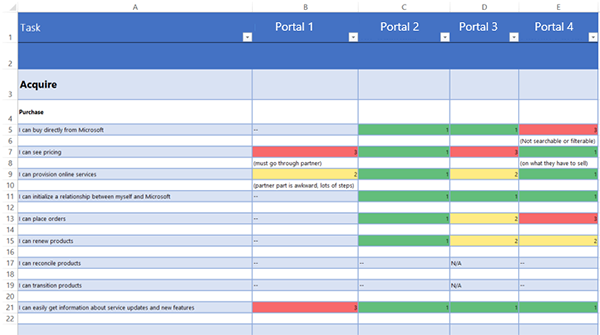
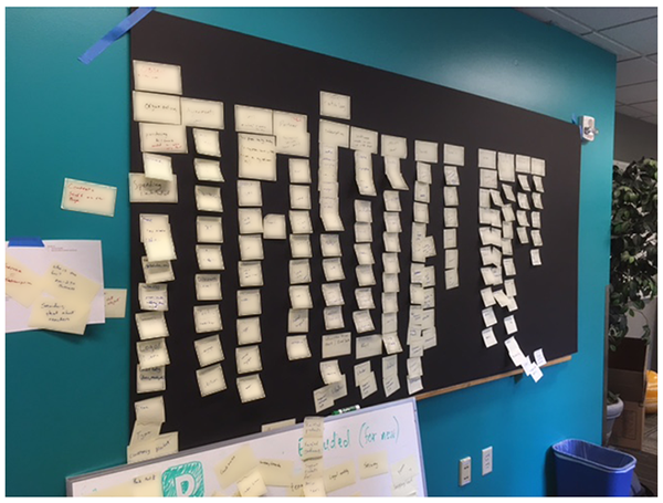
To redesign how commercial customers managed software, we first needed to understand how those tasks were handled across existing experiences. Over the course of the first week, our design team catalogued more than 125 tasks across four separate portals.
Each task was evaluated using a three-tier scale—Great Experience, Could Use Refinement, and Poor Experience. This audit gave us a clear view of where experiences were working, where they were breaking down, and where entirely new solutions were required. It also allowed us to focus the team’s energy on scenarios with the greatest customer impact.
Inquiry
While designers conducted the task audit, our research team ran sessions with IT managers to better understand their pain points and identify tasks they found either especially difficult or surprisingly simple. These insights were critical in grounding our later scenario work in real-world behavior rather than assumptions.
Comparative Analysis
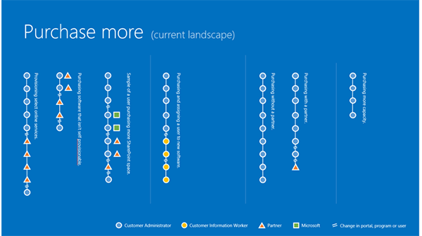
Using findings from the audit and inquiry, we selected three representative tasks that reflected frequent and meaningful customer activities. We mapped these tasks into simplified user flows that highlighted the number of steps involved, the participating personas and variations across portals.
These flows made complexity visible at a glance and became a powerful communication tool for aligning the team and stakeholders around the cost of fragmentation.
Scenario Generation
With a clearer understanding of user needs and system gaps, we narrowed the scope to a set of key scenarios that best demonstrated both customer pain and opportunity. These scenarios were crafted specifically to communicate value to executive stakeholders and build confidence in the direction of the project.
Initial Wireframes
We created a presentation that brought together research findings, audit insights, and early design concepts. Given the nature of the tasks and the needs of our stakeholders, we focused primarily on desktop experiences while remaining mindful of how these designs would adapt to tablet and phone form factors.
This work secured executive approval and allowed the project to move into full production over the following five months.
Ideation
With the project officially approved, we transitioned into ideation and early production planning. During this phase, we continued refining existing scenarios, added new ones to the backlog, and developed a multi-year UX roadmap to guide phased delivery.
Object Oriented UX
I recommended to the team that we adopt an Object Oriented UX methodology to define both short and long-term goals for the site. This process involved identifying key objects, their associated content, linked relationships, and supported actions.
Working through this framework helped us in several critical ways. It clarified which actions were essential for the MVP, highlighted the most important objects to prioritize, and provided a structured foundation for negotiating scope with stakeholders. It also enabled more effective collaboration with engineering partners by aligning UX intent with underlying data relationships.
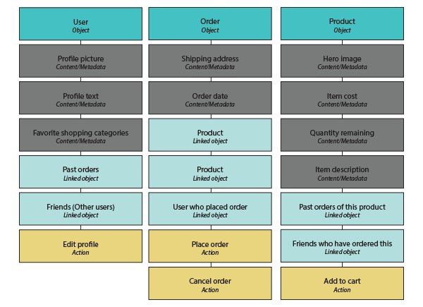
By visualizing these relationships, we were able to define a scalable information architecture and outline strategies for phased expansion over time.
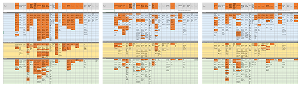
The above image shows a blurred version of our object map with various sections highlighted in orange to illustrate various strategies and phases to approach the long-term project. By creating these deliverables we were able to both help determine the scope of the project and define our information architecture.
Scenario Generation: Part 2
Once object relationships were established, we were able to articulate additional scenarios more quickly and deprioritize those that no longer aligned with release goals. This allowed the team to stay focused while maintaining a clear vision for future growth.
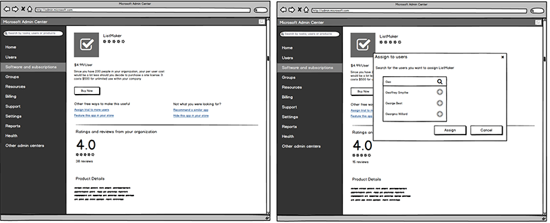
Wireframes: Part 2
These wireframes expanded on discovery insights and introduced designs for newly defined scenarios. Together, they supported the creation of a UX roadmap that showed how functionality could evolve across releases. In the near term, they defined scope for release one; longer term, they ensured designs accounted for future expansion across devices.
Production
With scenarios defined and scope aligned, the design team moved into production. We created final wireframes that would be used to build the live site. Through critique—using a process I helped reimagine—and regular stakeholder reviews, concepts from earlier phases were refined and approved for implementation.
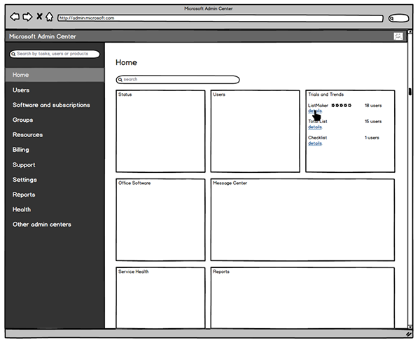
Final Wireframes
Scenarios and requirements were now in place and scope had been agreed to by our stakeholders. The other designers and I began to create the wireframes that would be used to develop the final site. Through critique (a process I helped reimagine) and stakeholder review ideas put together in earlier phases were refined and approved for production.
Visual Design
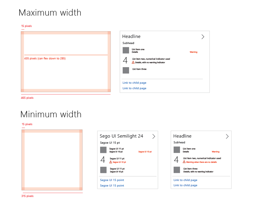
One of the core visual elements was a flexible card system designed to work across desktop and mobile. Cards could be simple or data-rich, depending on context, and were designed to scale in complexity as resources allowed.
As wireframes progressed, we defined the visual design of the site by combining Microsoft’s existing design language with new components that addressed emerging needs while remaining cohesive within the broader ecosystem.
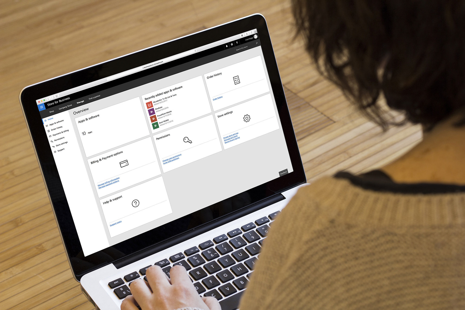
The Live Site
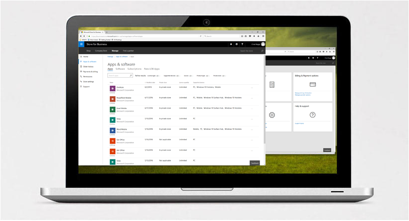
The final experience delivered a clear, trustworthy way for commercial customers to manage software, users, and purchases. Where customers previously relied on manual spreadsheets, they could now browse software, understand what had been purchased, and see how licenses were assigned.
Earlier systems offered little visibility into user access. The new experience made assignments transparent and actionable, allowing customers to manage access directly from the product interface.
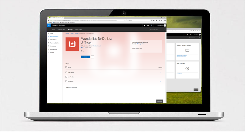
Customers could see not only what software they owned, but which users it was assigned to—and easily make changes as needed.
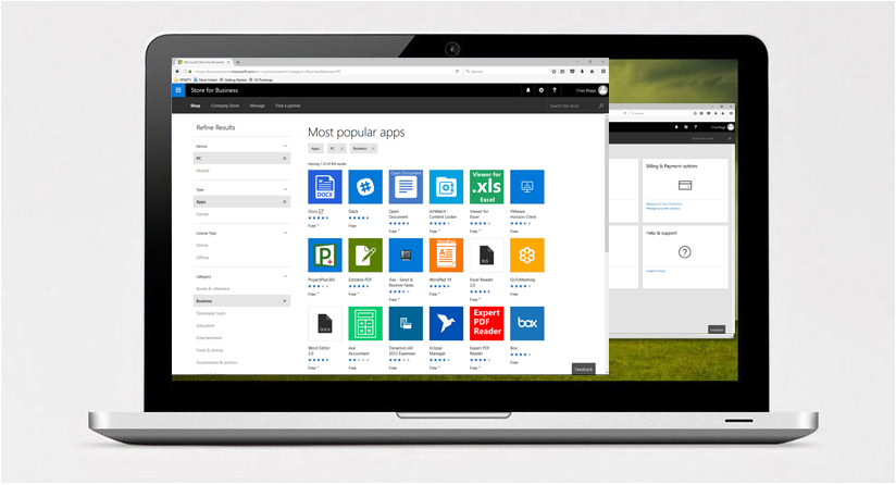
Searching and discovering new software was improved through robust filtering, helping customers navigate a complex catalog with greater confidence.